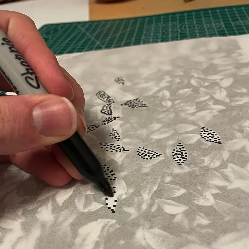
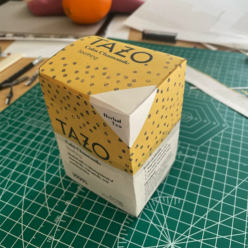
Project Brief
The Client
This project began as an effort to understand the shortcomings and pain points of current packaging design for TAZO and other tea brands, and counter these with a refreshed packaging system. This was done as a hypothetical, and TAZO was not officially involved.
My Role
I collaborated with a small team in research. From there, we developed solutions independently. I am the sole creator of every other effort.
Timeline
32-40 hours over 5 weeks
Project Results
The Problem
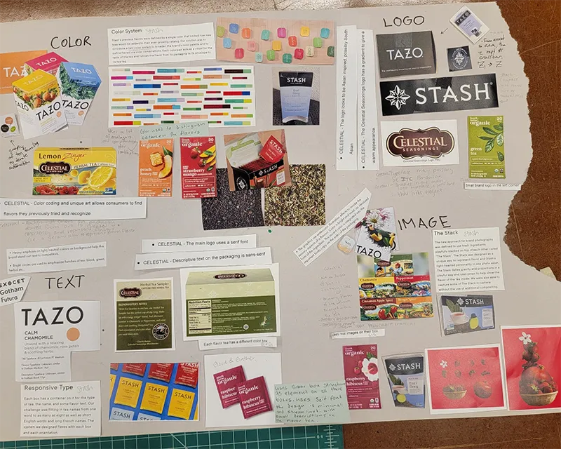
Desk Research, Competitive Analysis and Interviews were performed to understand the most important areas to pursue. The Pain Points discovered included:
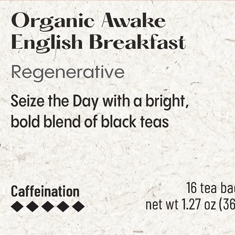
- Caffeine levels are not adequately conveyed.
- Recycled paper used is not adequately advertised as a selling point.
- Pictures of ingredients have negative perceptions to consumers.
- Minimalist design leads to low trust when not associated with a generic store brand.
The Solution
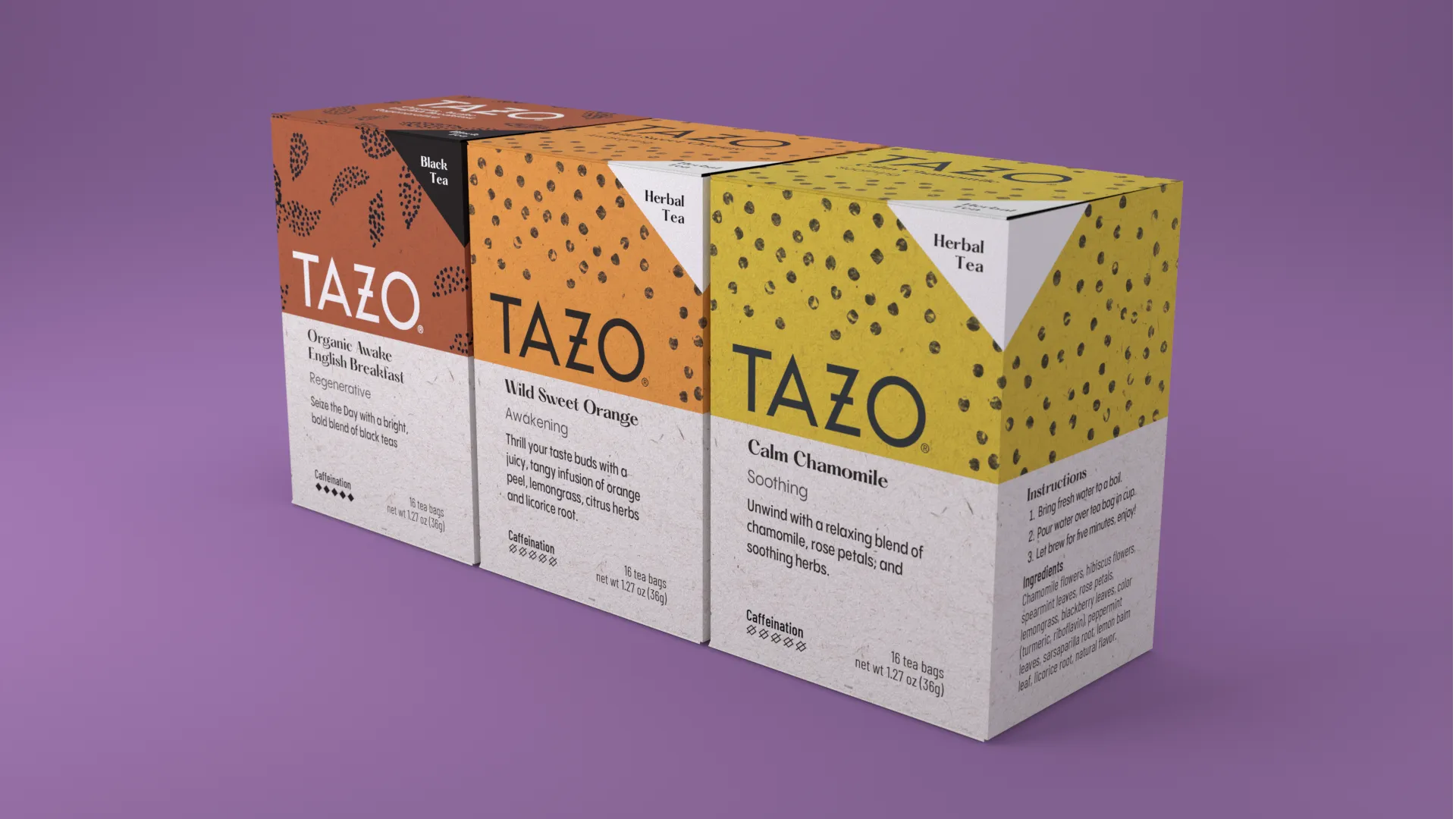
The final system is one that prioritizes authentic appearance & efficiency. I created an abstract ornamentation system through printmaking and placing points in a mathematically harmonious way.
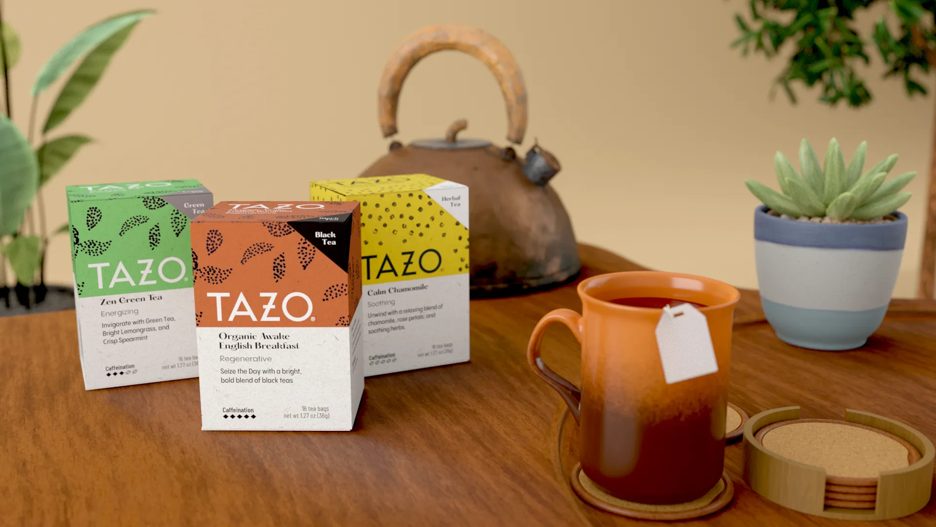
Design Highlights
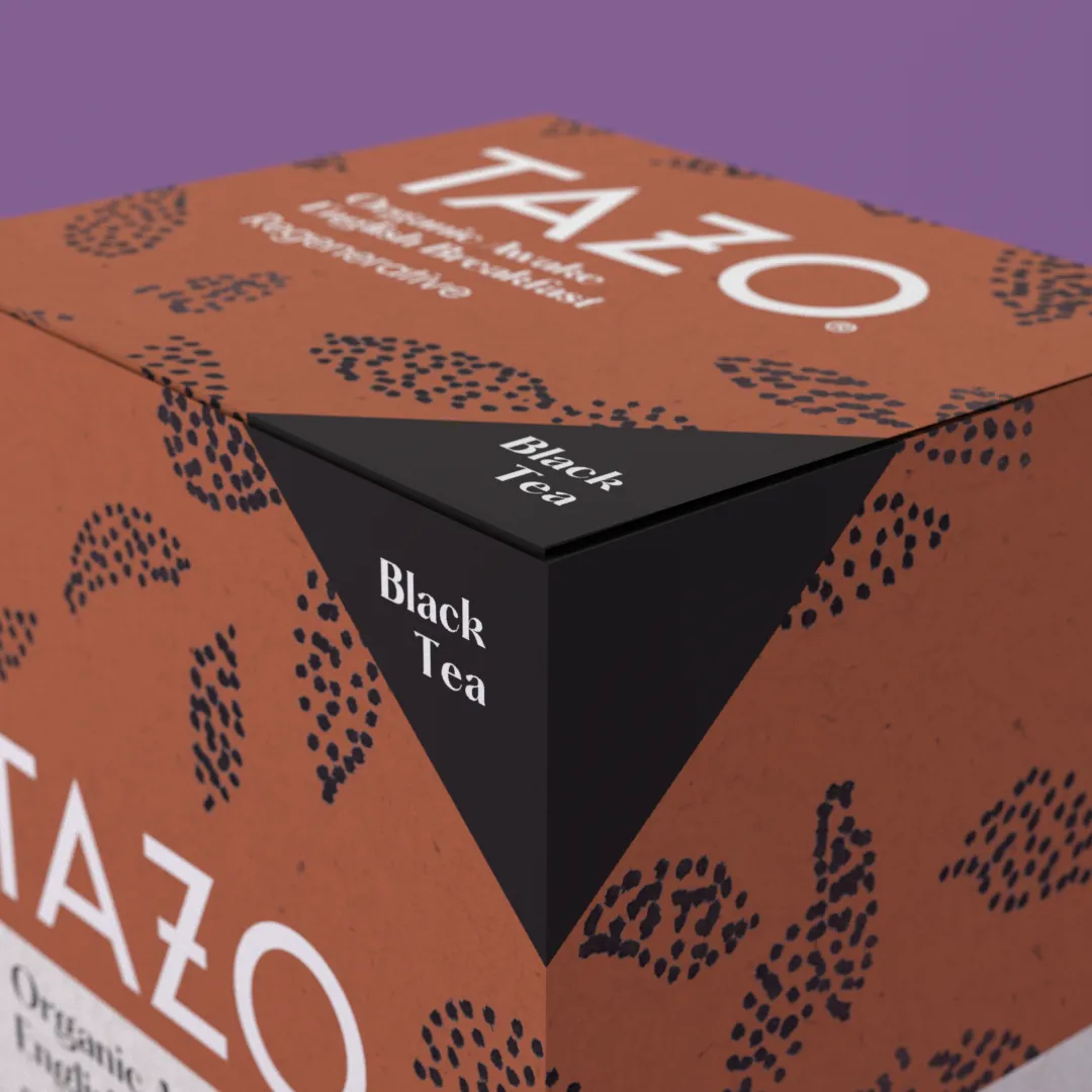
Caffeinated Mark
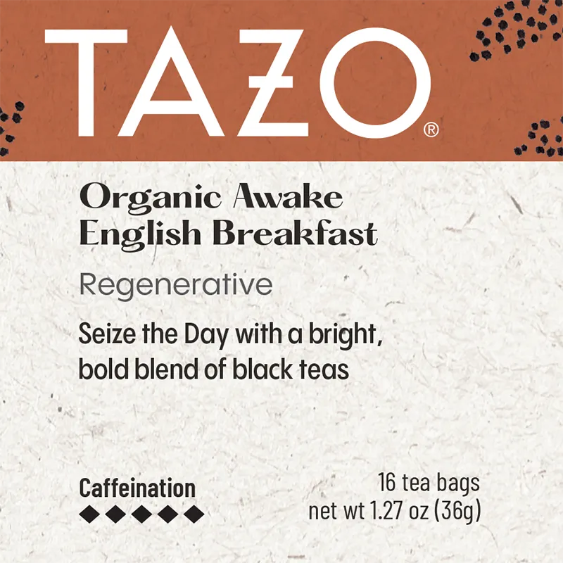
5-star Rating
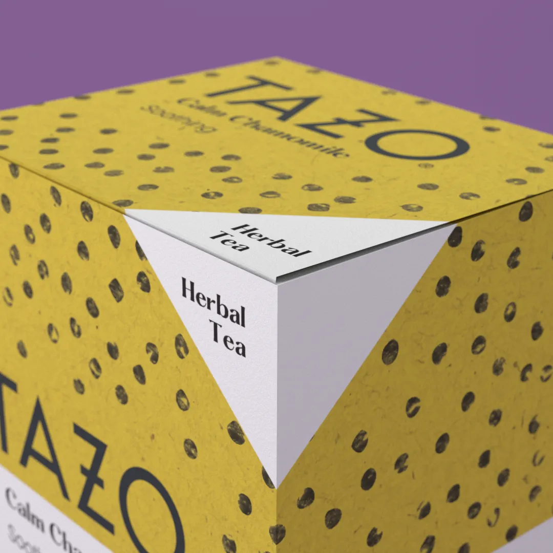
Decaf Mark
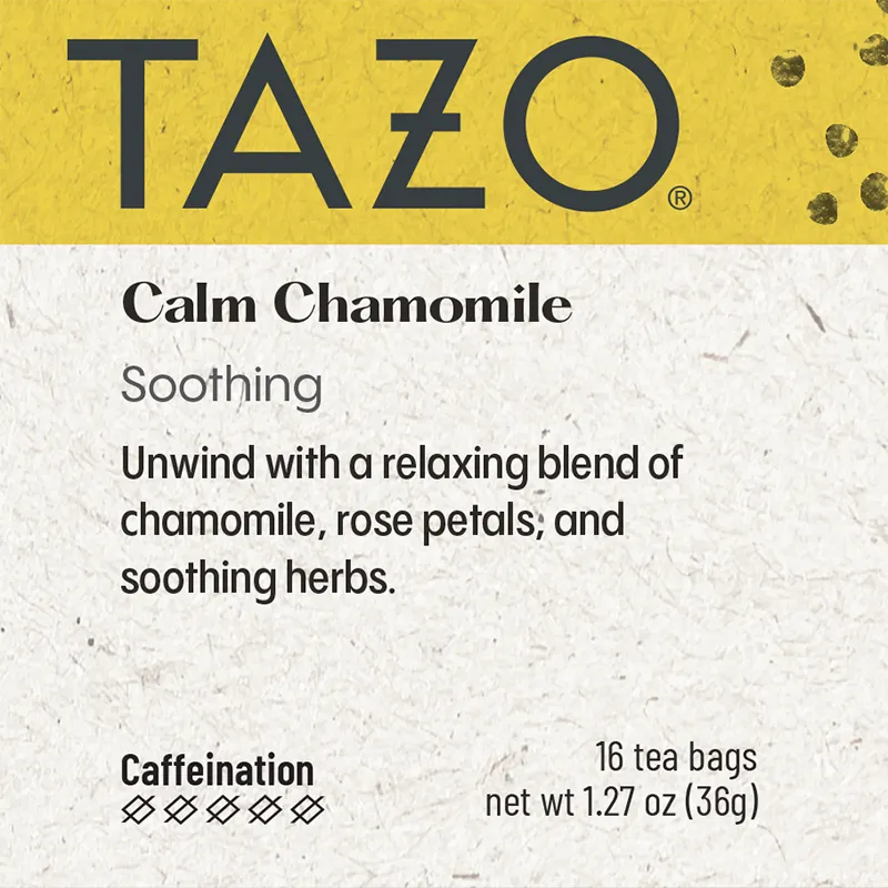
0-star Rating
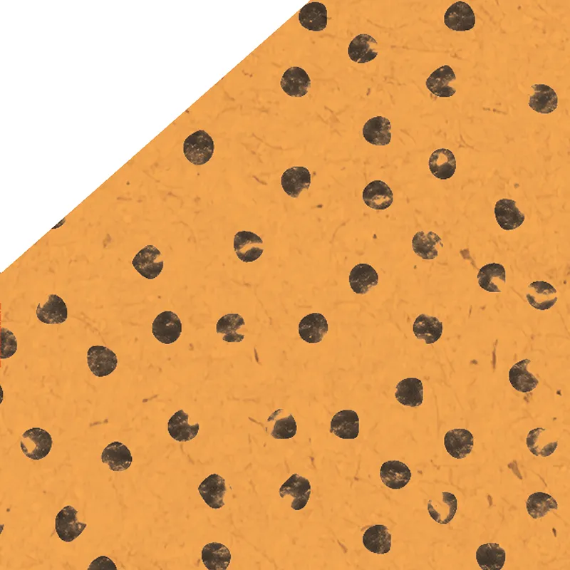
Caffeine Pattern
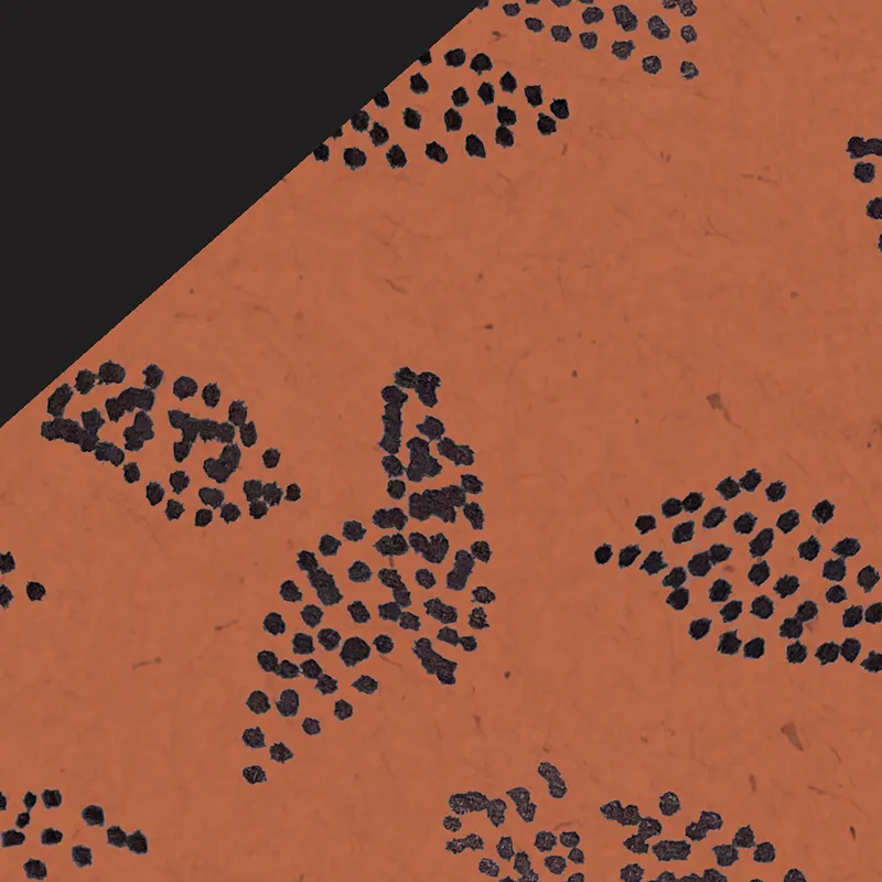
Herbal Pattern
Clear Hierarchy
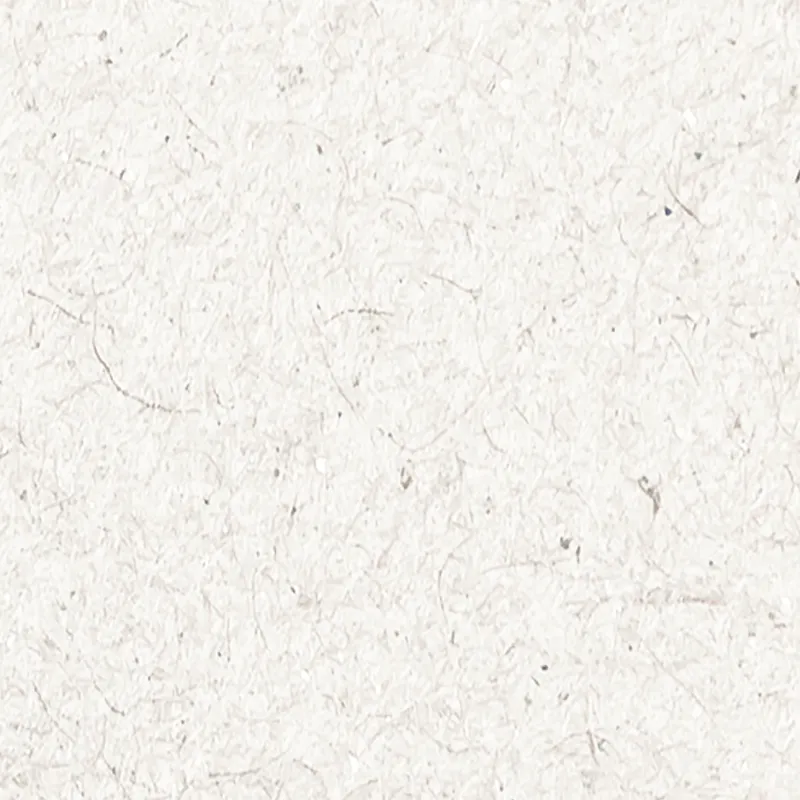
Natural Material
Project Methodology
My Design Process
Research
Desk Research
Competitive Analysis
User Interviews
Analysis
Research Synthesis
Pain Point Grouping
Problem Statement
Ideation
Experimentation
Type Pairing
Card Sorting
Design
Typesetting
Illustration
Prototyping
Feedback
User Testing
Designer Critique
Stakeholder Critique
Revision
Detail Fixes
Print Prep & Test
Final Prototypes
Key Learnings
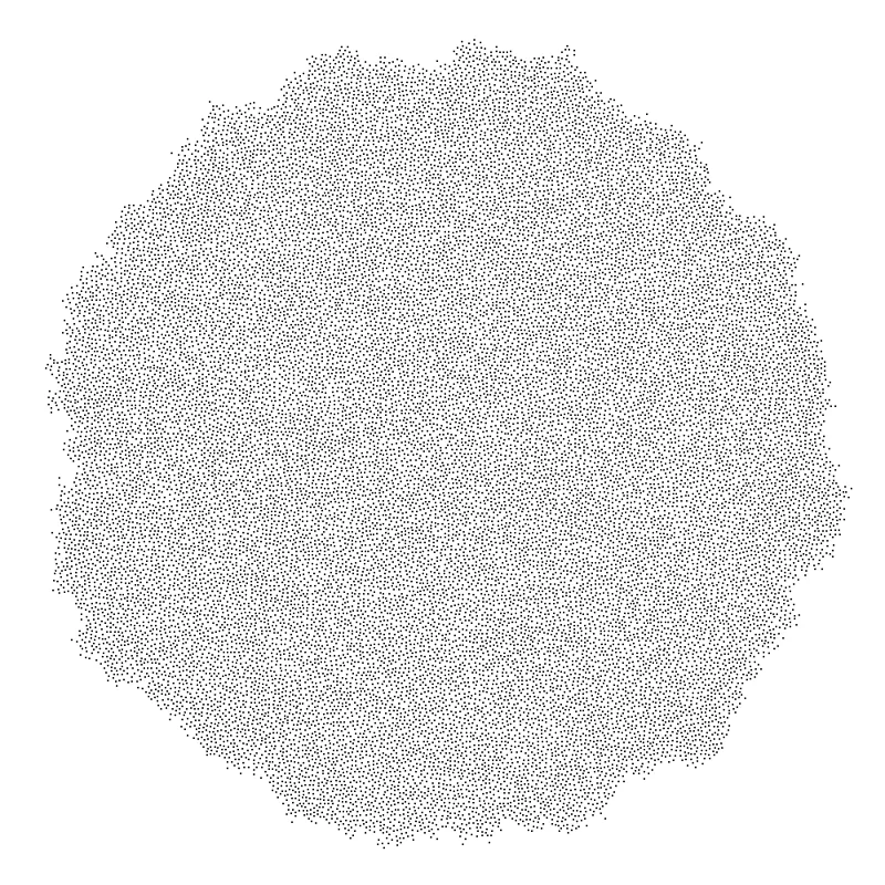
I researched ornamentation methods to counter the pain point of image based packaging. I ended up using an algorithm to generate points in a harmonious distribution (Poisson Disk Sampling.) From here I replaced the dots with hand printed dots to convey hand made abilities & build a sense of joy in the consumer.
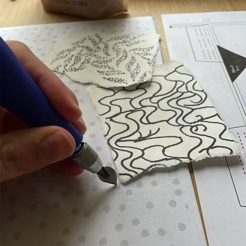
After brainstorming I found that sharpies created a fun imperfect texture for tight dot patterns. This is how I made the tea leaf pattern. I performed extensive experimentation of what typefaces to integrate into the new system. Paper prototypes were constantly printed and assembled to test legibility & balance in the package.
